STEMCORD
Scope of work:
- Conducted a detailed internal and external brand audit through interviews and surveys.
- Developed a comprehensive brand strategy, refining positioning and crafting a new narrative.
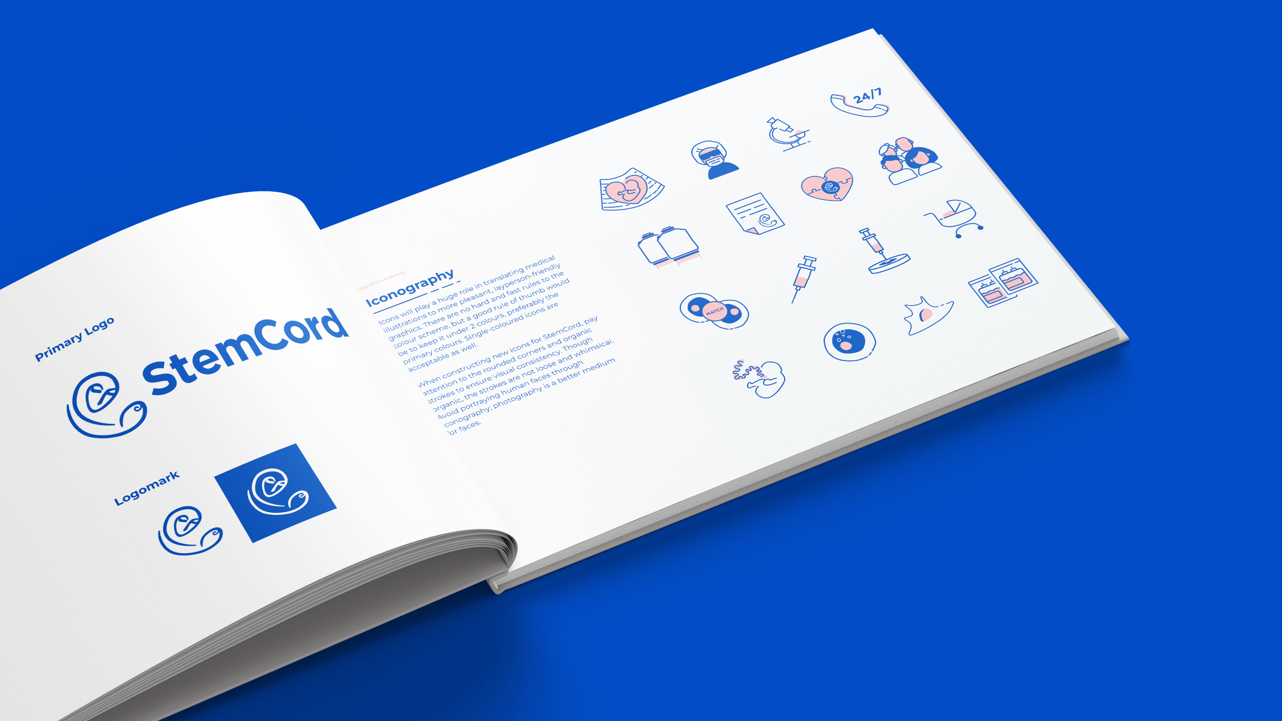
- Revitalized the brand identity by updating and implementing new guidelines.
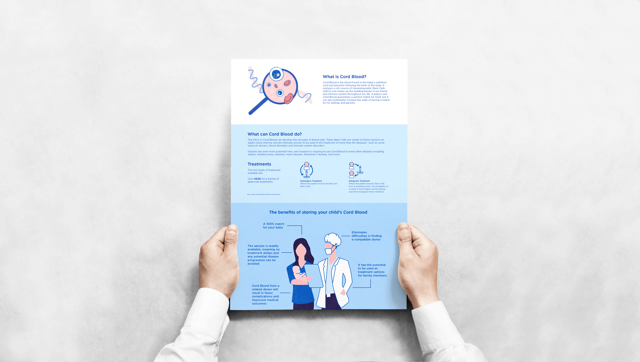
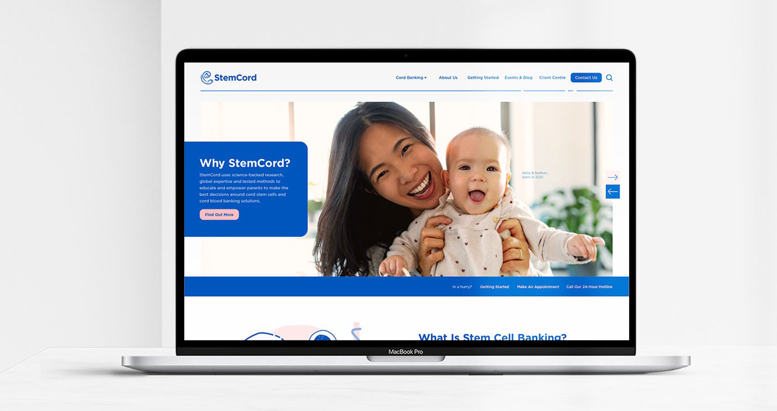
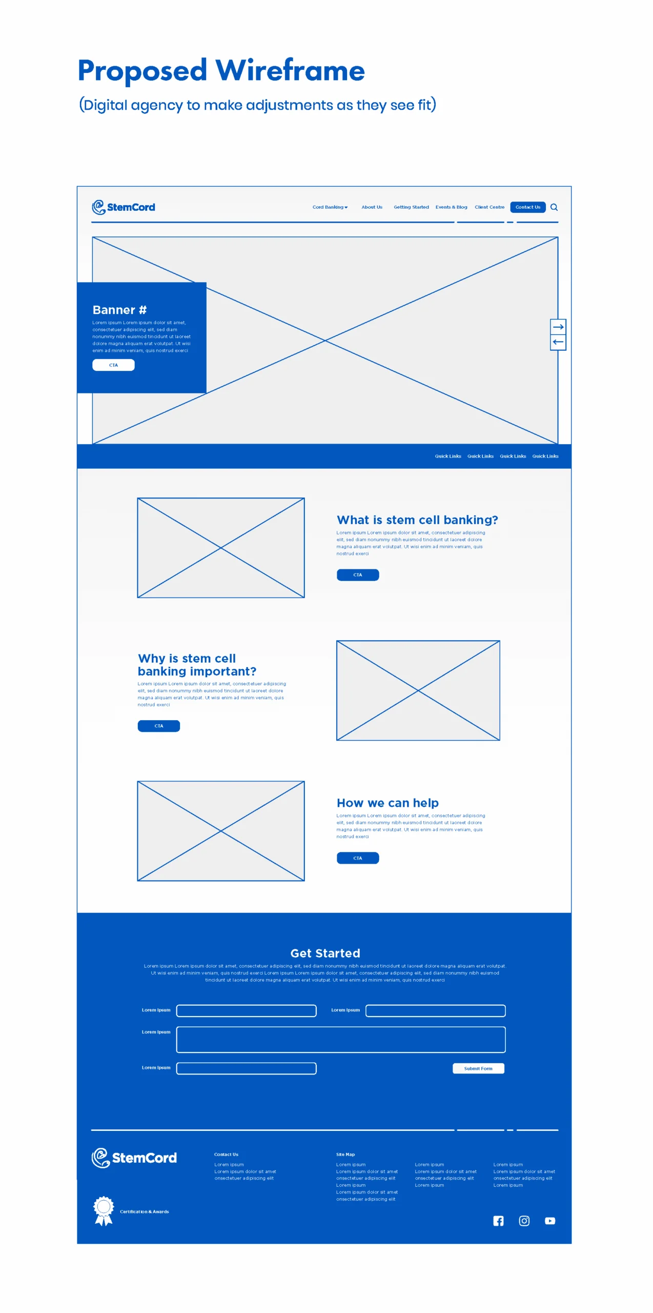
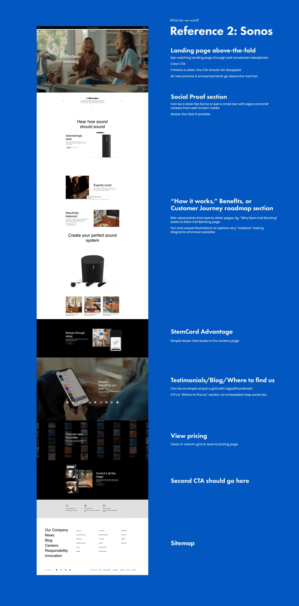
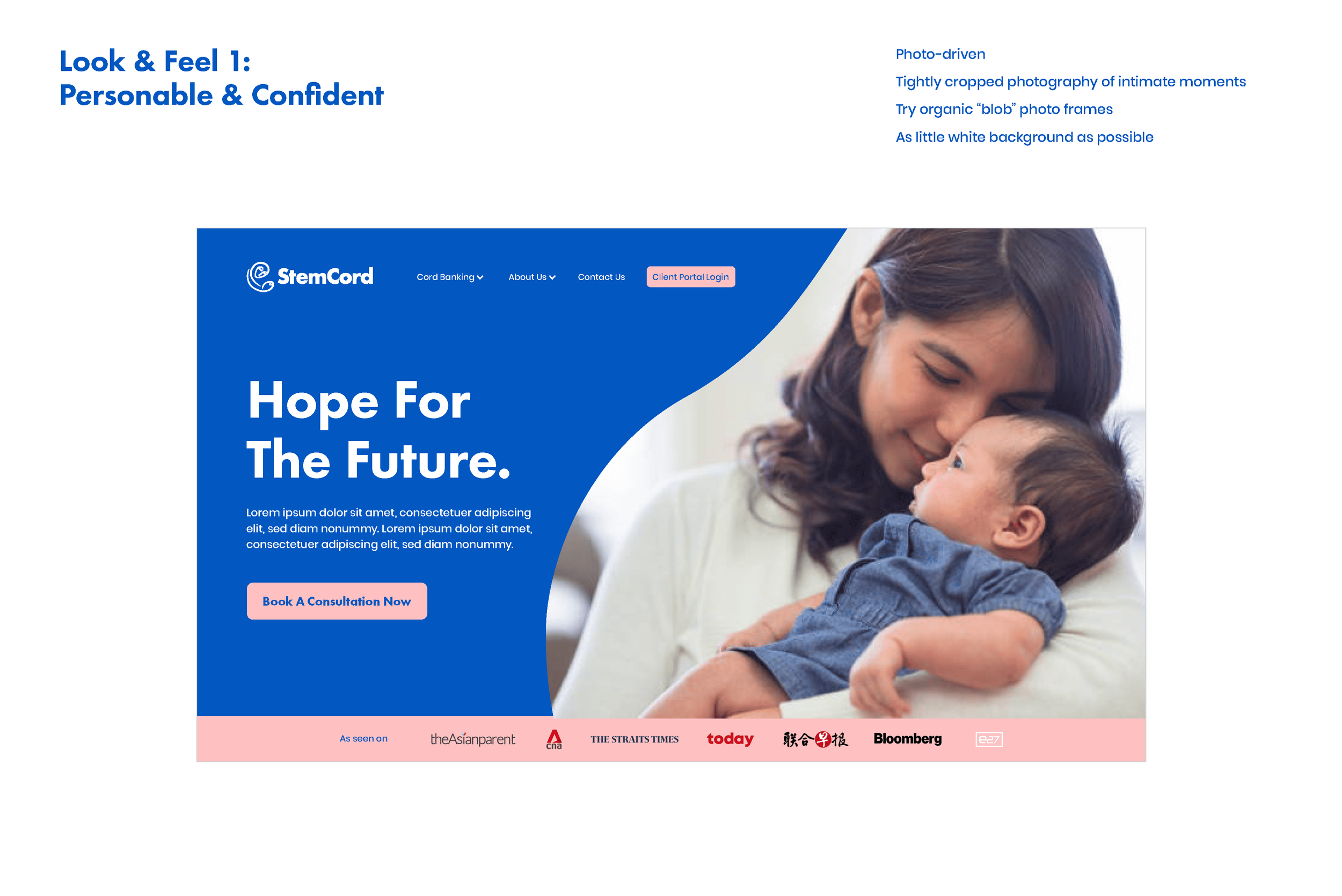
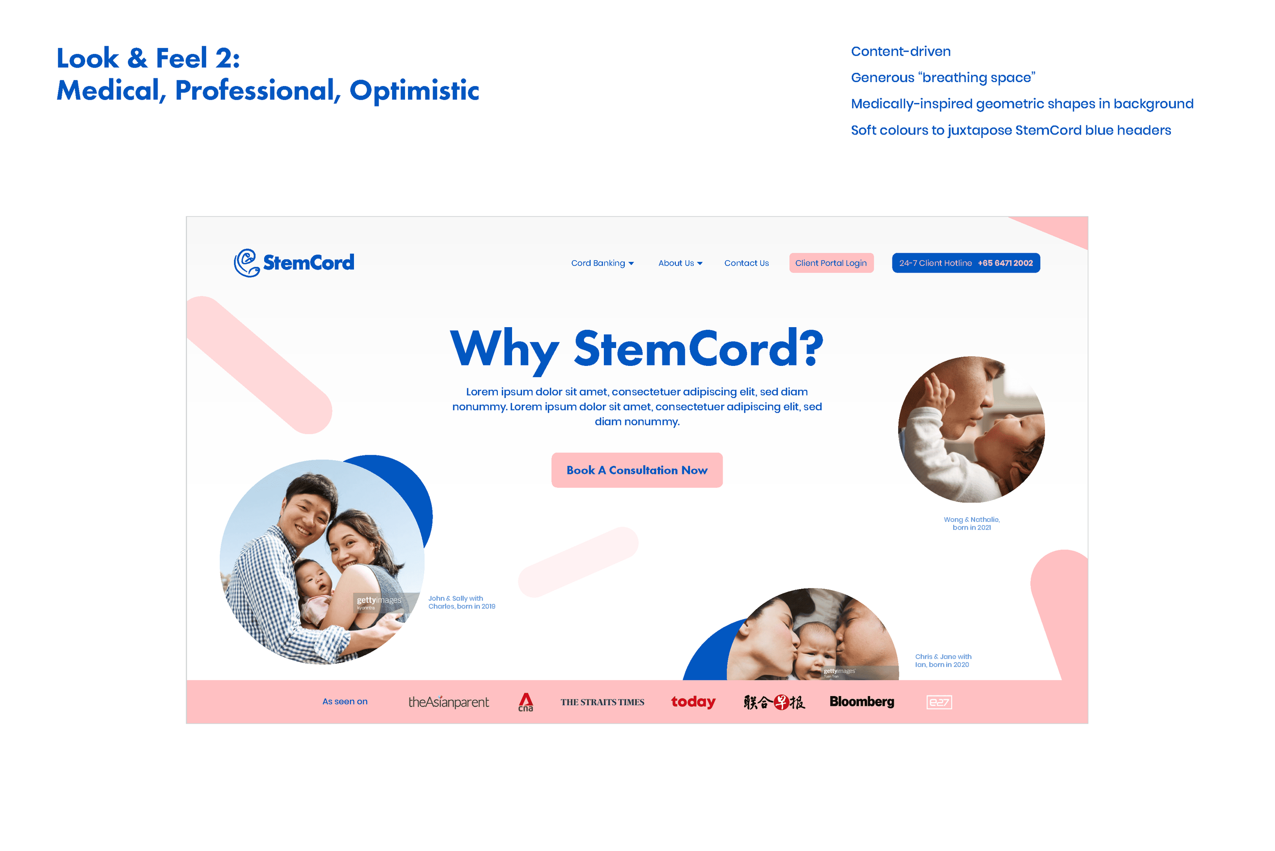
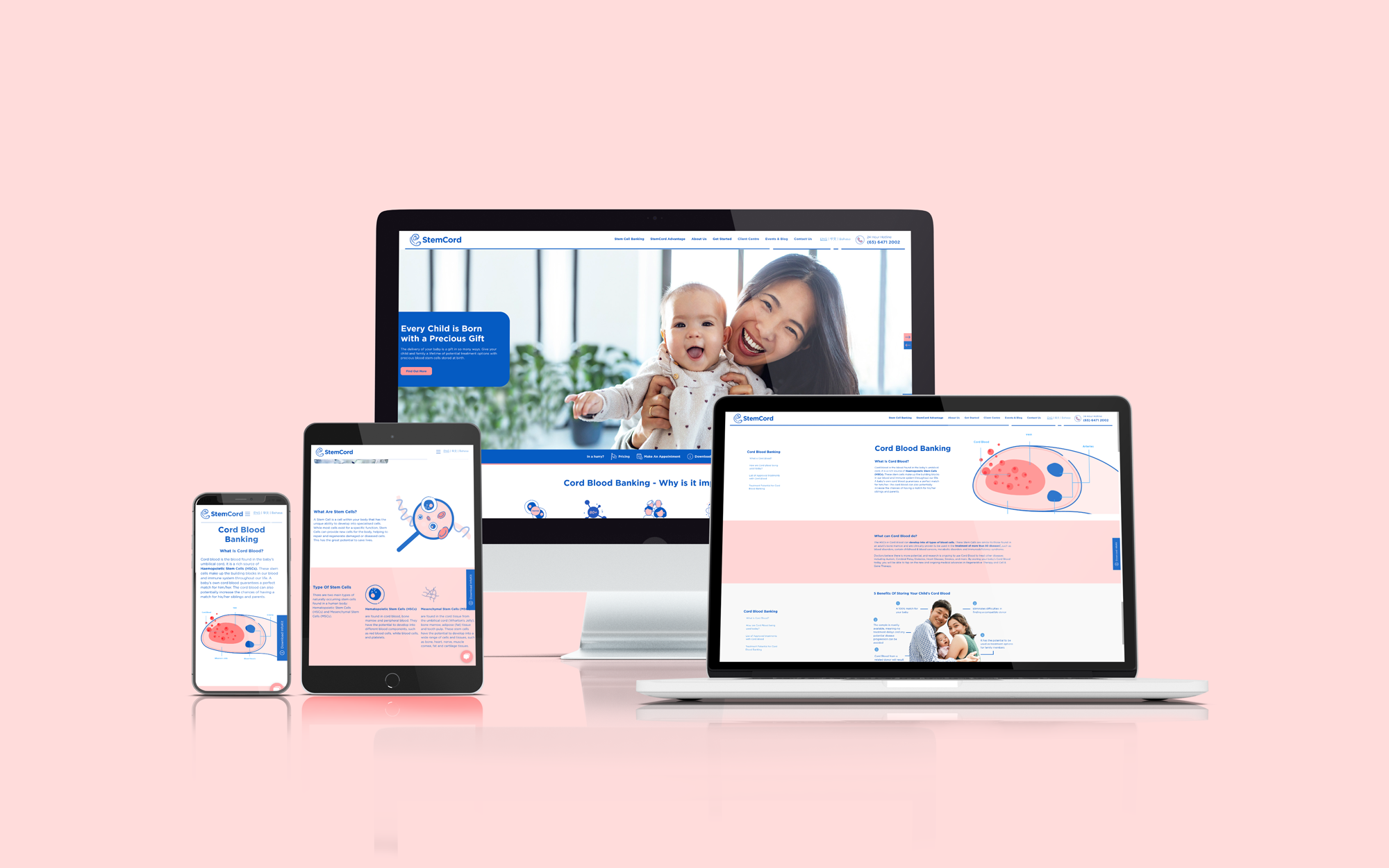
- Redesigned and rewrote StemCord’s website to enhance brand recognition and deliver clearer messaging.

Breathing New Life Into A Legacy Brand
StemCord, a cord blood bank with roots in Singapore, was founded by a distinguished team of medical oncologists, hematologists, and physicians. After two decades of saving lives and preserving potential, the team recognized it was time to refresh their brand presence to stand out among their local and regional competitors.
We conducted a brand audit to identify opportunities for growth and refinement, including a brand survey and stakeholder interviews. The result? A refreshed StemCord—honoring its rich legacy while embracing a modern, clinical-yet-approachable aesthetic, ready to serve a new generation.
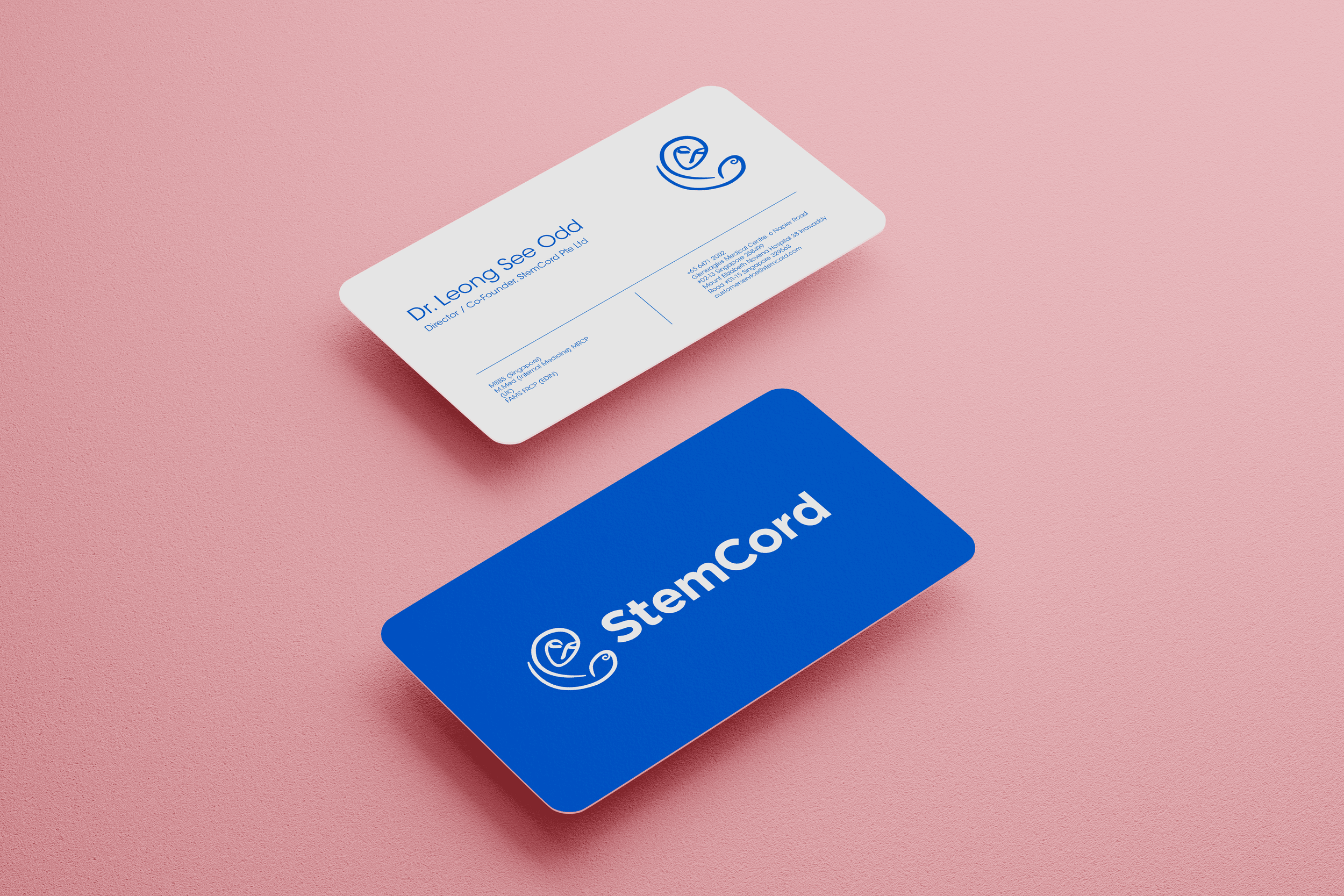
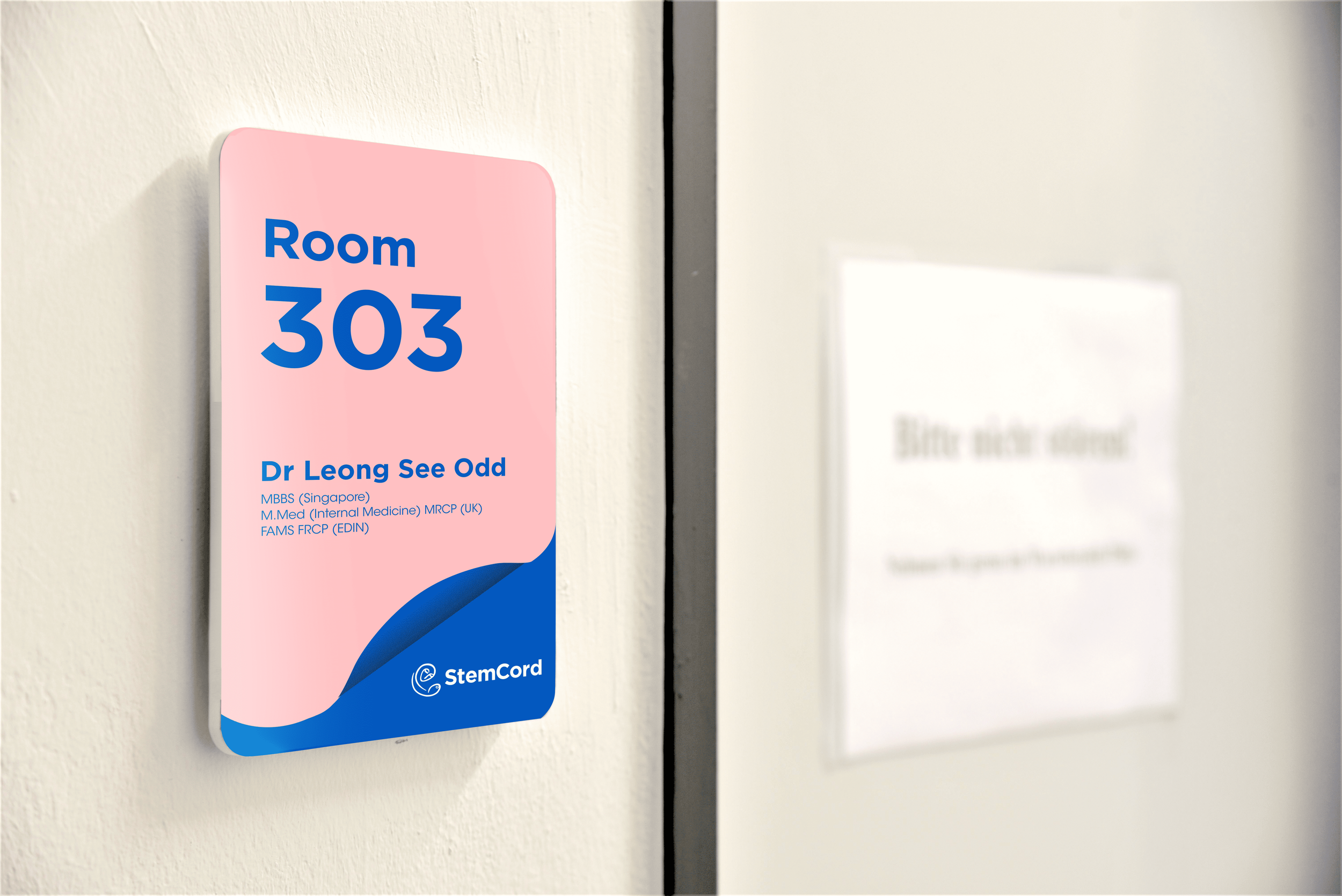
By retaining its iconic logo and introducing softer, brighter colors, we balanced tradition with transformation. We also refined StemCord’s key messaging, brand voice, and identity to create deeper connections with its three core audiences—because every connection matters.
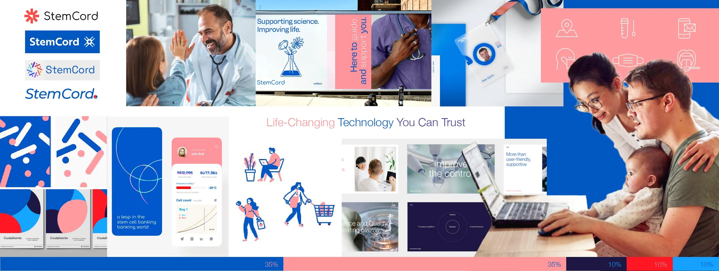
This stylescape (hyper-personalised moodboard) was a key piece in helping the stakeholders decide on the visual identity that fits their vision for the brand. Three stylescapes were presented to StemCord. This stylescape is titled, “Science for the Family”. German healthcare and medical brands, such as Bayer AG, B.Braun, Siemens Healthineers and Merck Group inspired me at this stage.
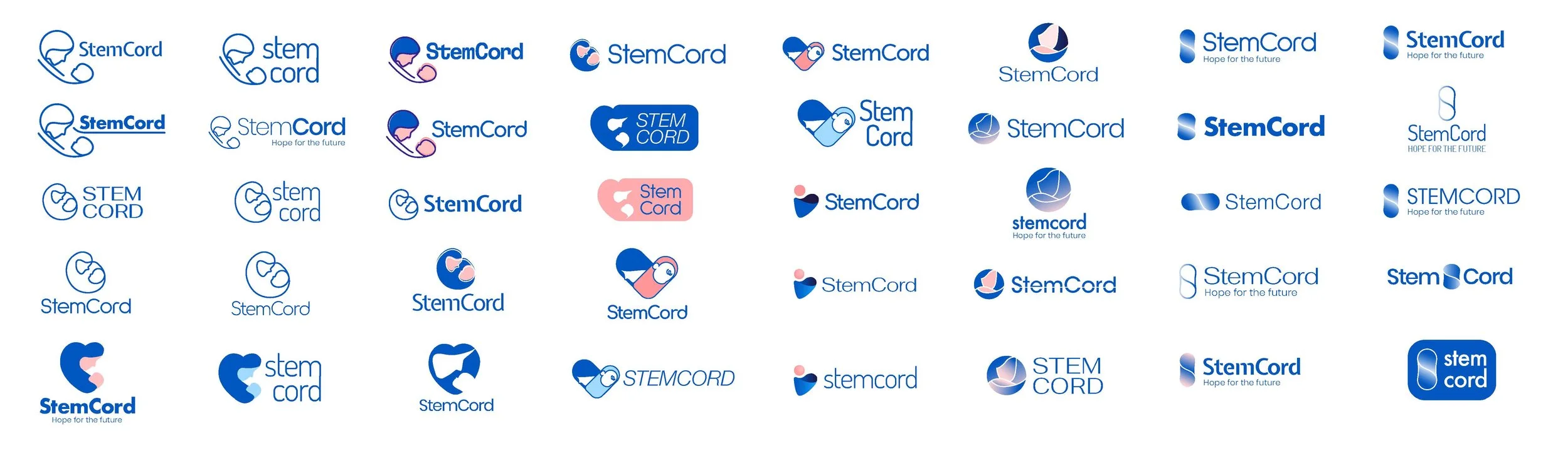
Logo Design Exploration
We reimagined StemCord’s logo in a variety of ways before aligning on a gentler approach that keeps the legacy logomark. The reason behind this is that StemCord still has a large number of early adopters in their clientele who feels sentimental about what the logomark represents.
The result is a logo that takes our stylescape into consideration while keeping the familiar mark.
Visual Identity
Before

After


Website Design
My responsibilities
- Creative and Art Direction
- Account management
- Graphic design & illustration
- Print & web design supervision